
August 18, 2026
From Obelisk to Pillar: How the Modern Freddie Award Was Designed
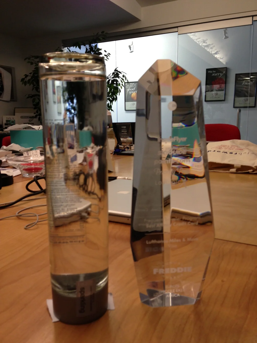
For most of the Freddie Awards' first quarter century, winning a Freddie meant carrying home a piece of faceted crystal. The obelisk. Tall, many-sided, heavy enough to double as a doorstop and reliably impressive under a ballroom spotlight, it was the trophy an entire generation of loyalty executives learned to recognize on a colleague's credenza.
It was also, as Randy Petersen liked to point out, roughly the same shape as everyone else's award.
Why change a trophy that worked?
The obelisk had done its job. It said award in the universal language of engraved crystal. But by the early 2010s the Freddies were changing around it. Voting had gone global, the ballot had gone multilingual, and the ceremony had grown from an industry gathering into a night that programs built campaigns around. The award on stage needed to look like it belonged to that moment rather than to 1988.
Randy's brief was short and, characteristically, a little stubborn: he did not want more facets, more engraving or more ornament. He wanted less. A minimalist form that read as status from across a room and needed no explanation up close. Something quiet enough to sit on a desk for twenty years and still look deliberate.
Enter Society Awards
The Freddies took the brief to Society Awards, the New York studio whose work travelers already knew even if they had never heard the name. Society Awards designs and produces the Emmy, the Golden Globe, the MTV Video Music Award, the American Music Award, the Academy of Country Music Award, the Billboard Music Award, the Dancing with the Stars trophy and the trophy handed out on The Voice. Placing a travel loyalty award in that company was itself part of the point.
What came back, in a study dated February 2013, was a set of concepts that took the brief in every plausible direction at once - and a few implausible ones.
The concepts that didn't win
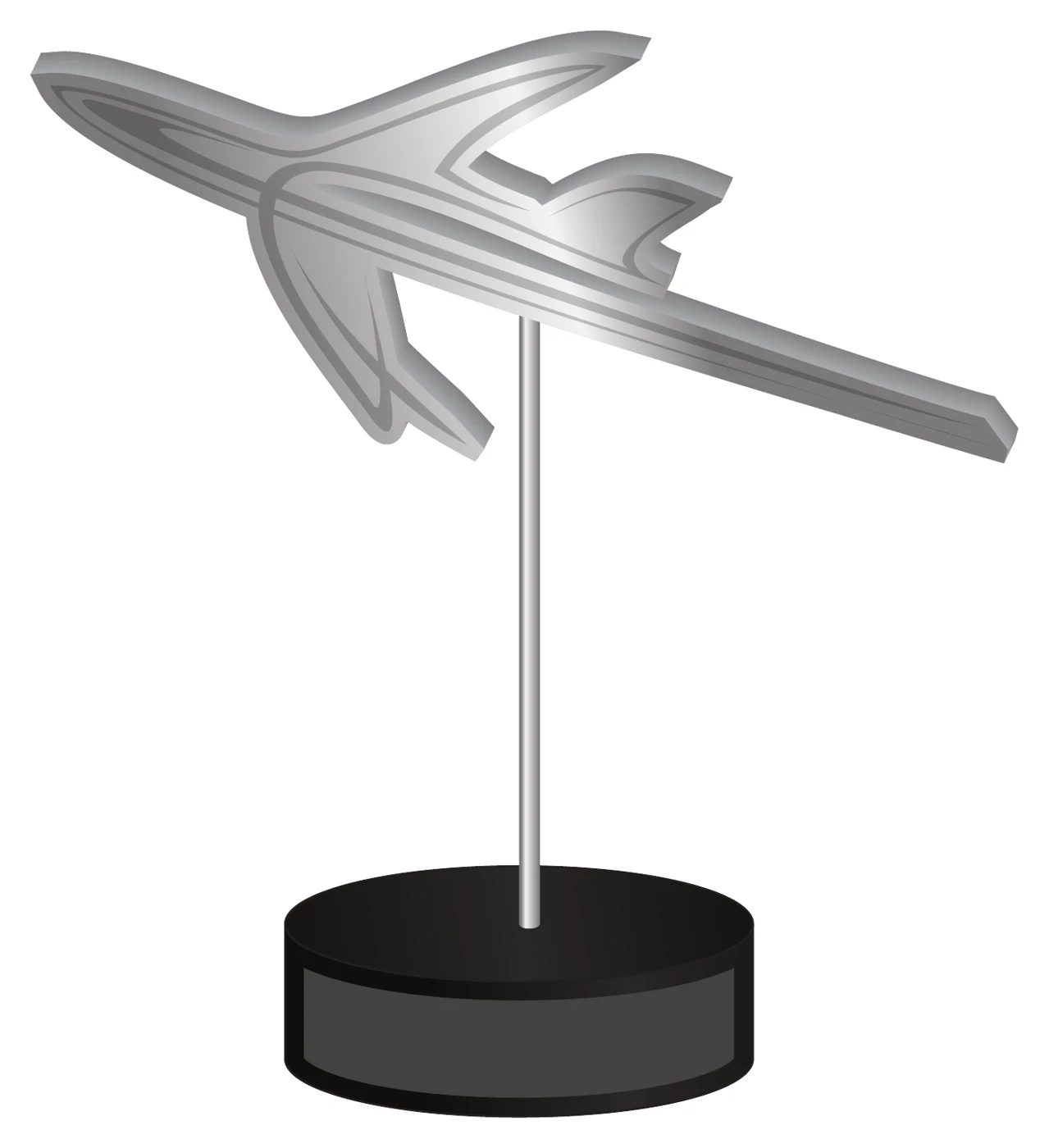
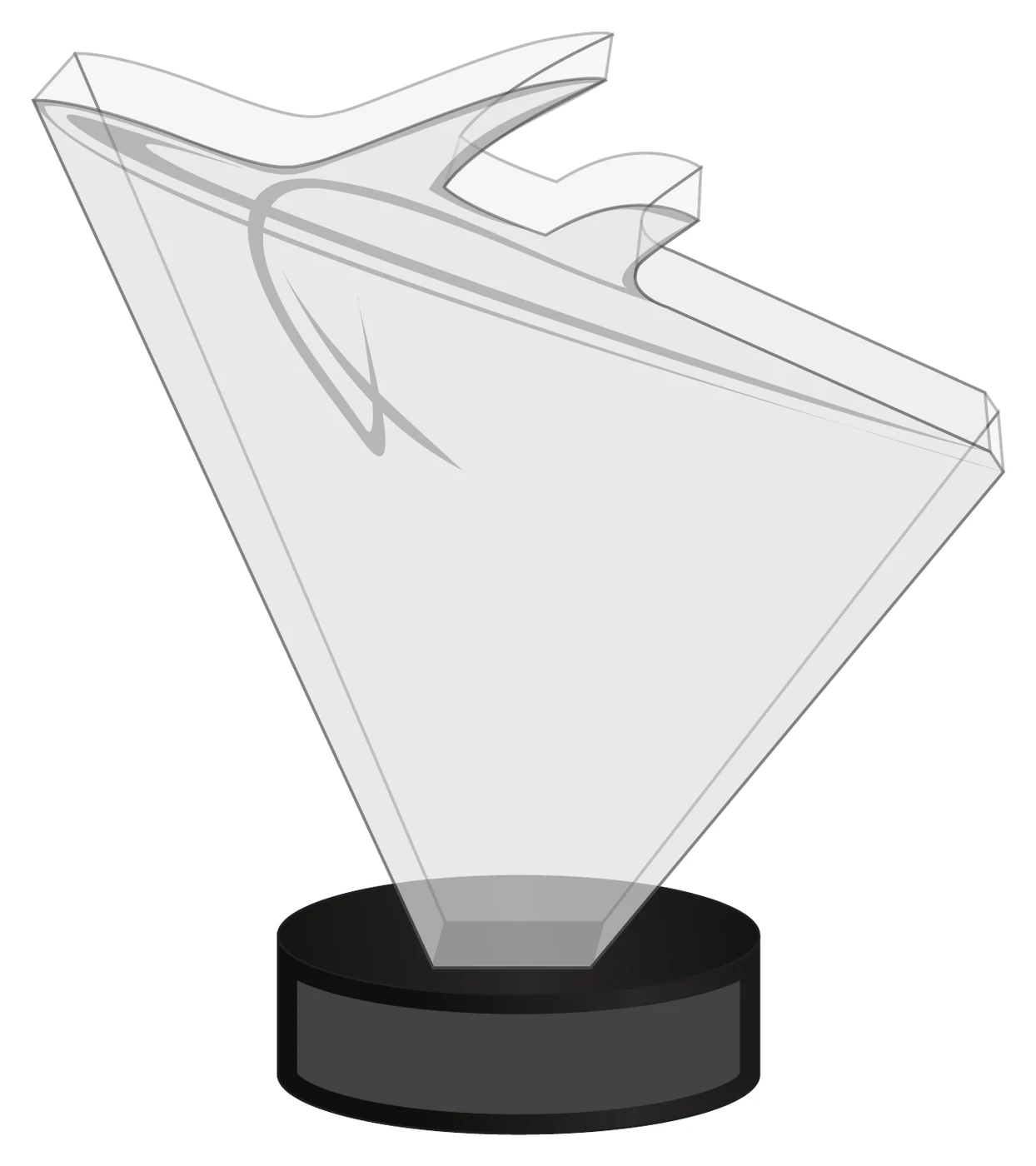
Several directions leaned literal. A polished aircraft floating on a slim post. A crystal wedge with a jet etched into the glass. These were handsome, and they were exactly the sort of thing a travel award is expected to be.
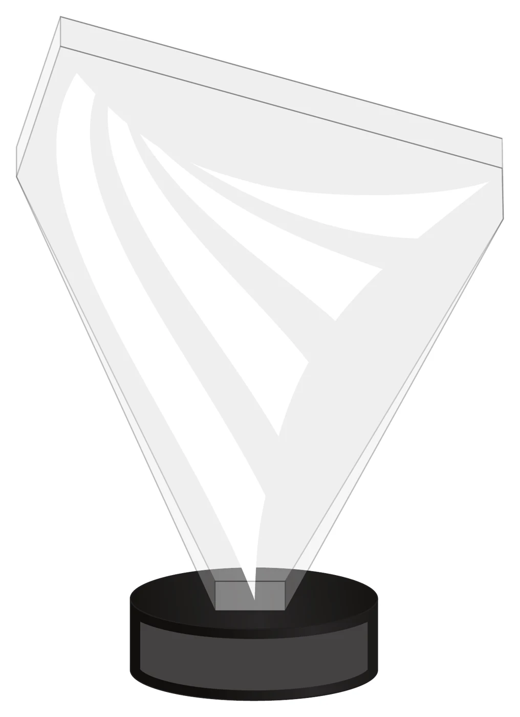
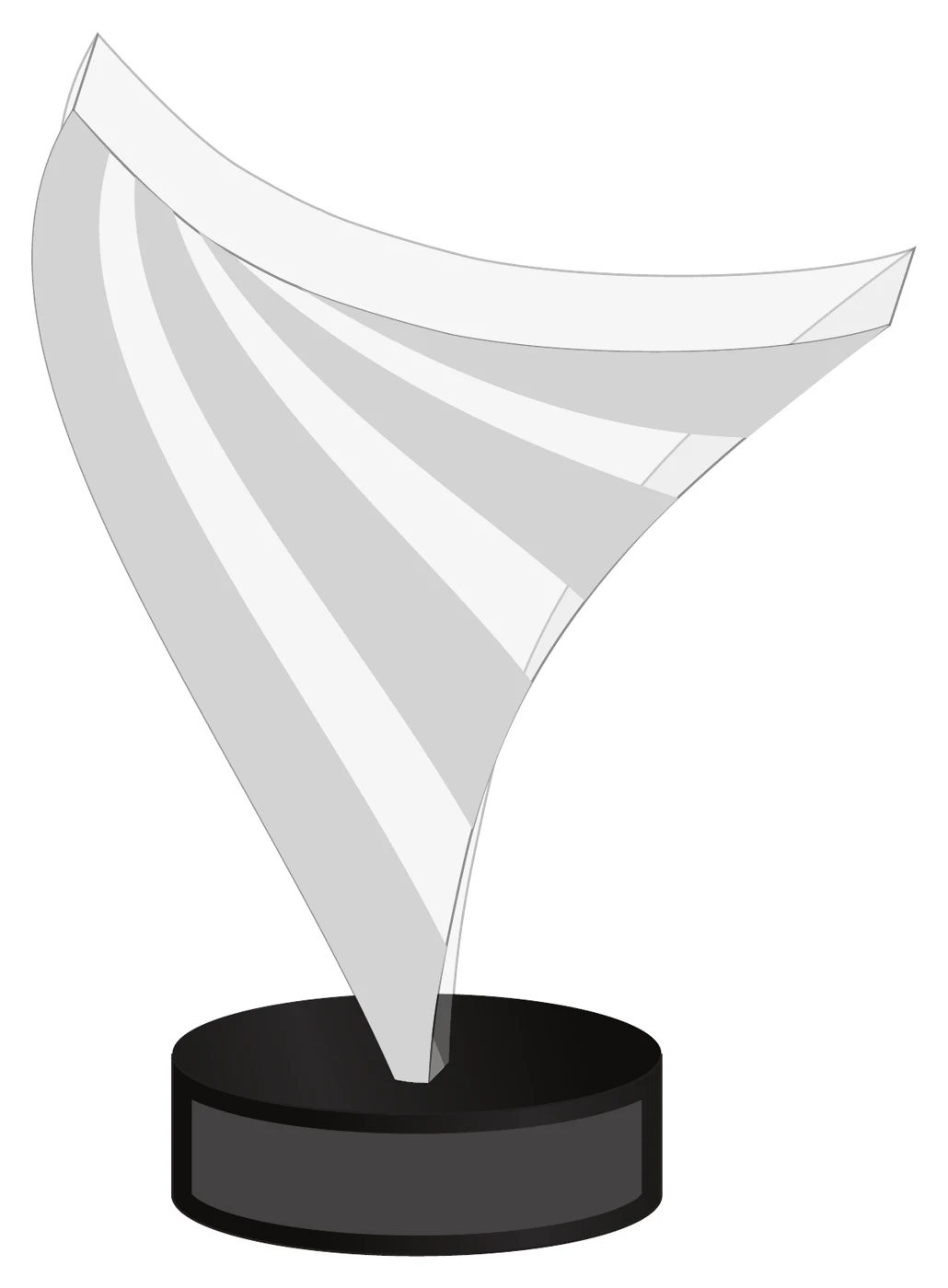
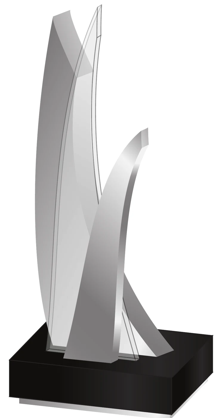
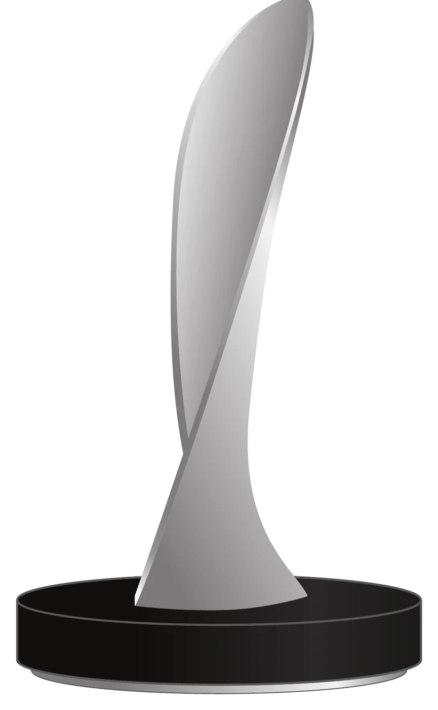
Others went fully abstract: sails, wings, flames, ribbons. Motion rendered in metal.




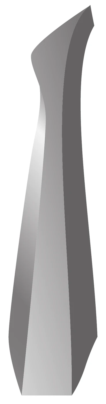
The one that became the Freddie
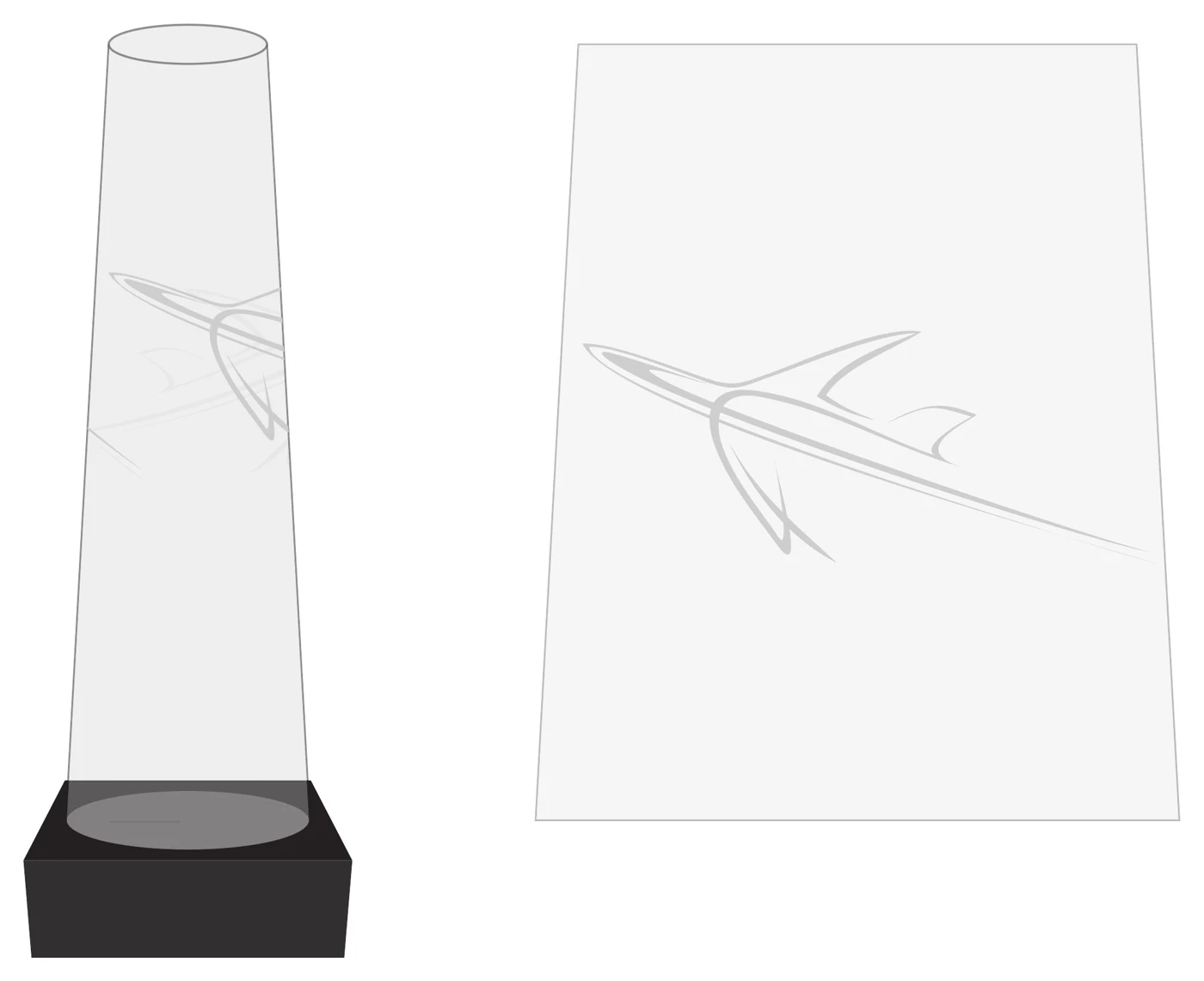
The direction that survived was the least decorated of the set. A tapered column - a pillar - rising cleanly from a black base, with the aircraft not bolted on top but etched faintly inside the glass, visible only when the light and the angle agree. Everything Randy had asked for: status, simplicity, and no ornament competing with the name of the program engraved on it.
Produced in optical crystal, the pillar debuted at the Freddie Awards in 2013 and has been the trophy ever since. It photographs well in a winner's hands, it stacks sensibly in a shipping crate, and - the practical test of any award - it survives being carried through an airport by someone who has just spent an evening celebrating.
More than a decade on, the pillar has done what the obelisk did for the twenty-five years before it: become the thing you recognize instantly in a program's lobby. The difference is that nobody mistakes it for anyone else's award.
Concept artwork courtesy of Society Awards, from the 2013 Freddie Awards design study.